Pantone Picked It, But Did Anyone Actually Stick With It?
For the last 25 years, 26 different colors have received the prestigious title of Pantone Color of the Year. But are these titles self-proclaimed? Does being crowned the Color of the Year actually mean anything? And how, if at all, do these colors influence trends in design, fashion, or even technology? Lots of people are incredibly skeptical about whether this title is just a marketing scheme, while others base all their artistic choices for the year off of this color. In many ways, colors can be reflections of mood, culture, and innovation. With 2025 being halfway done, we’ll be looking not only at 2025’s Color of the Year, but also taking a closer look at where we’ve seen this year’s color so far.
What Even is The Color of The Year?
Now that the stage has been set, let’s dive a little bit deeper into what the Color of the Year even is. The Pantone Color of the Year is an annual selection made by the Pantone Color Institute, meant to capture the global mood or cultural climate at the time. The selection encourages the design community to engage with color more intentionally, sparking conversations about the potential connection between color and culture. The Pantone Color Institute is a division inside of Pantone, specializing in color trend prediction, color psychology, and brand consultancy. Starting in the year 2000, what was initially a branding move to expand Pantone’s influence in the fashion and design world later became a global conversation regarding how color reflects the human experience. Each year a new distinct color is chosen; so what makes these colors unique?
The color selected each year is a lot more unique than your everyday color. This is primarily due to why the color was even chosen in the first place. For each respective year, the selections are based on trends, how culturally relevant it was, as well as the potential symbolism and storytelling the color is associated with. Let’s use 2021 as an example. In 2020, as we all know, the COVID-19 pandemic and lockdowns happened. 2021 was the year immediately following the most controversial and world-changing year in a long time. Because of this, going into 2021 was a very emotional time for a lot of people. This definitely altered Pantone’s selection, as for the second time ever, they decided to elect two colors for Color of the Year. The colors chosen for 2021 were Ultimate Gray and Illuminating. Ultimate Gray is a calming, neutral gray, symbolizing the resilience and peaceful, quiet strength the world had going into 2021, as well as the fatigue and fear many individuals faced in the middle of a global pandemic. Illuminating was meant to give a duality to the neutral feeling of the gray. It is a bright, ecstatic, hopeful yellow offering optimism and a joyful contentment to the end of the pandemic. Two colors were used to contrast each other to better fit the cultural emotion everyone was having into that year. As you can see, the selection process isn’t entirely random, and there’s an actual discussion on what color should be selected each year. With that being said, those were the colors for 2021; so what about 2025?

2025’s Color of the Year
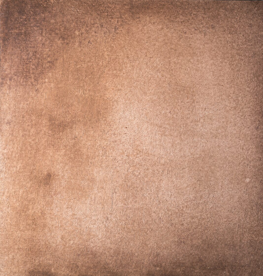
Now that you know a little bit more about what the Color of the Year is, let’s talk about 2025’s chosen color. The Color of the Year for 2025 is Mocha Mousse, an airy, light brown shade layered with hints of a rich, chocolatey undertone. In recent years, especially with new blooming technologies, such as AI, everything has been a lot more fast-paced. Simple tasks have never been easier, and people’s attention spans have been declining. With Mocha Mousse’s soft, earthlike tone, it offers a comforting and reassuring effect. It’s believed Pantone chose it to represent 2025 as a message for people to slow down and reconnect with simplicity. The name is obviously inspired by a dessert, evoking a sense of luxury and pleasure, connecting to the movement of self-care, reminding people it’s okay to celebrate smaller victories and to indulge more in this very busy world we’ve created. With the simplistic theme, it’s very likely those could both be potential reasonings, but has anyone even caught on?
Where Have We Seen Mocha Mousse So Far?
Half the year is already over, and Mocha Mousse has set a few trends. In the worlds of interior design and home decorating, multiple paint brands like Benjamin Moore, PPG, and Behr have created Mocha Mousse inspired shades, such as Cinnamon Slate, Grounded, and Purple Basil. Fabrics like velvet have been often paired with Mocha Mousse and similar shades. Many appliances now come in vintage, lighter brown shades, such as Mocha Mousse. In the fashion industry, many runways and red carpets have showcased softer brown shades known as “latte,” heavily inspired by Mocha Mousse. More luxurious designer brands, such as Gucci or Fendi, are now offering many mocha colored leather products, such as outerwear or luxury suede items. Even graphic designers have been using Mocha Mousse for branding and print, as well as utilizing it to bring an earthlike luxury vibe. Social media, such as Pinterest and Instagram, have seen a popular rise in mocha toned aesthetics from outfit ideas to home decor ideas. This adoption shows Mocha Mousse is more than just a simple trend. It has the potential to influence what society wants in the world of clothing, products, and comfort.

Do These Trends Mean Anything?
So after going through where the color has mainly appeared this year, do these trends even mean anything? The trends are suggesting that people crave a more calming, warming, and securing atmosphere. During these fast-paced digital times, it’s hard to reconnect to a more earthly, slower environment. This color helps bring that out, and the trends surrounding the color can help show these feelings to real people and society. The popularity of cozier colors and materials emphasize a more comfort focused style of life that is all about simplicity, sustainability, and permanence. Fashion brands capitalizing on this color ties into the idea that it brings a sense of luxury. This is not necessarily the luxury of being rich, but the luxury of being able to relax. Ultimately, it tells us that society in 2025 is valuing comfort and simplicity as a contrast to the fast-paced digital age we’re currently living in. Understanding this allows us to form a stronger psychological connection with what it means to be human, giving everyone hope for the future of humanity.
TL;DR
Overall, Mocha Mousse was selected as the color for 2025 to help provide a sense of security in these fast-paced digital times, appearing in and influencing many different fashion and social trends. Its rise allows us to better understand what humanity may be seeking in this rapidly growing digital age.
